In my last blog I presented an interpretation strategy designed to identify audiences critical to the success of a site and give examples of interpretation programs to reach those groups. Those examples all involved personal interpretation. A interpretation plan would include non-personal interpretation: Exhibits, signage and publications. To be effective a site needs to employ a variety of interpretation methods that let the visitor choose the media that best suits their time, group, planned activities, and learning style.
Everything begins with identifying your mission, specific site resources, one or more specific site themes, and the audience.
Working this like a sandwich, the bread on the bottom is your mission, it should be clearly written without paragraphs of bureaucratic-like jargon. You should be able to state it in one sentence and it be understandable by all who hear you. OK – that’s done.
On the other side of the sandwich is the bread of the audience. In this case, we are considering exhibits and publications that are seen or picked up at the park. Thus, you have instantly defined your audience as those who come to the park. We said that this is a very important group of people. Some are tourists, some are local folks. Those local folks are especially important. While tourists make a wonderful audience because everything they see is new and they are curious about your site and love to attend programs, local folks are the ones who can really take action on your behalf. If we agree that interpretation is about provoking people to take action, then these are the people you really want in your park, in your programs, reading your exhibits, and picking up your publications. Local folks can volunteer, can return for program after program, they can donate, and they can vote. Those are important people. Local people tend to not attend so many programs, but they do read exhibits, especially wayside exhibits when placed where the message meets the resource.
The ham and cheese are your resources and your site’s primary story, or overarching theme.
Here are a couple of concepts for creating effective exhibits.
Above, I used the common term, non-personal media. We in the field know that means interpretation delivered without a person talking to you. However, we also now that is a bad term, that all interpretation should be personal, whether it’s a video, exhibit or brochure, it should recognize you as a person and speak to you in a warm, friendly personal manner. It should be organized and written for easy, comfortable understanding, and written in the language we speak everyday. I don’t mean English, I mean in our casual vernacular, spoken English (or Spanish or French as appropriate for the expected reader). That spoken language is quite different from the language we were taught to write in school. When reading a brochure or an exhibit it should be as though we are speaking with a friend: relaxed and casual.
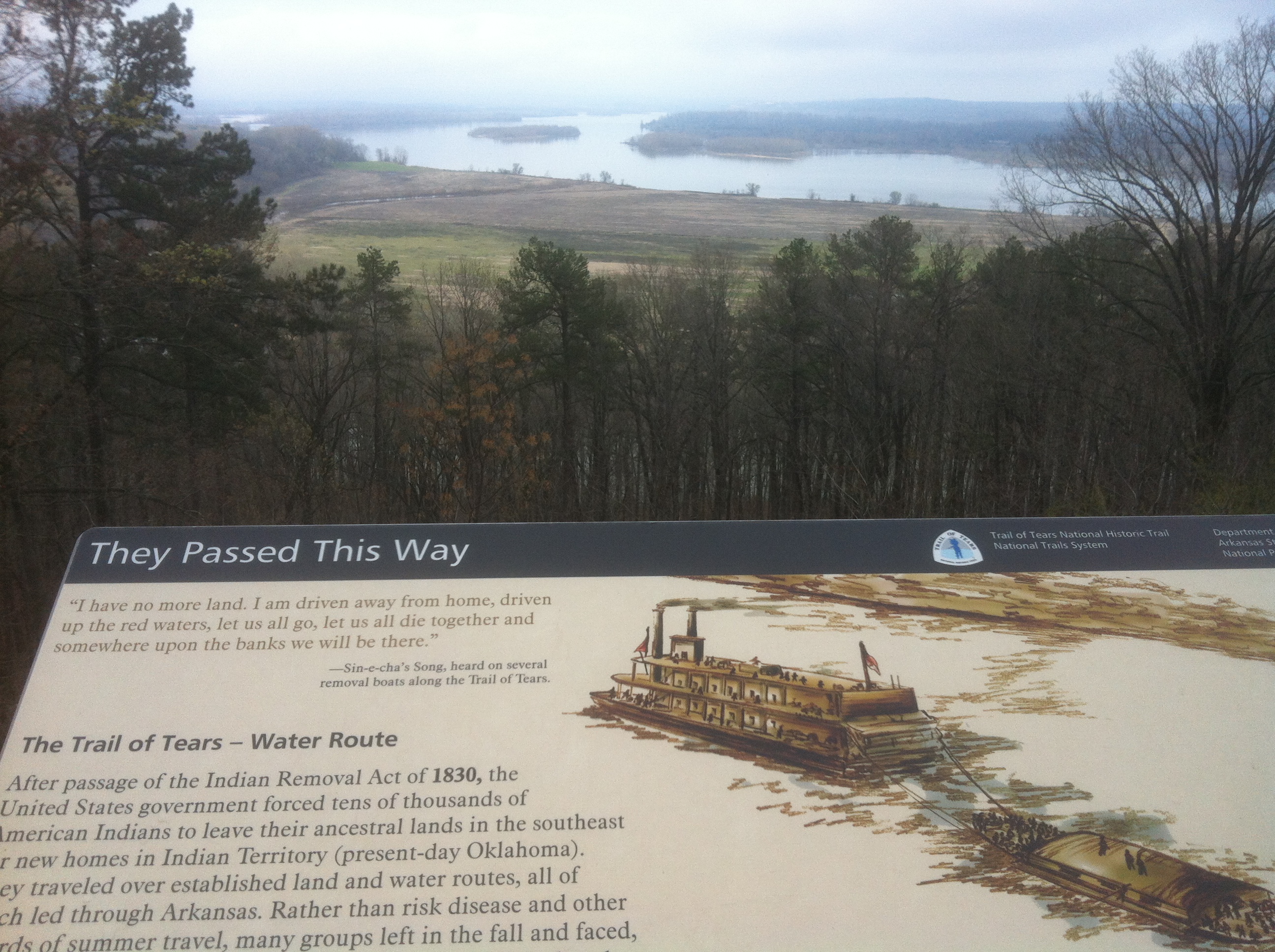
In designing exhibits, teaching Interpretation of Historic Sites, and through NAI the Visitor Studies Association I have learned a lot about successful exhibits. Here are some things to consider.
Studies continue to show that when a paragraph exceeds about 70 words the visitor glances at it, does a ‘cost/benefit analysis,’ determines that’s too much work and walks away. Don’t get log winded when writing. Know what is important and get to it.
Rather than a 120-word paragraph, breaking those 120-words into three paragraphs is encouraging and holds readers, increasing readership. Making lengthy text appear to be less, works.
Placing the text next to, or wrapping it around an object or image significantly increases readership as opposed to having a block of text on one side and images on the other. People area attracted to images and objects, not text, they look at the image or object then want to read about it. If you want to lose readers, make them search for a number somewhere or look through a paragraph of text to find what they want. The best text is well-developed caption.
People look at an exhibit in a certain order.
The headline – Make it a complete sentence that says something important, never a single word. For example, I have seen an exhibit titled: ‘Lithics.’ First – how many people know that term? A few, so you’ve lost a lot of folks who know you are not writing for them and they just walk away. Second: So what? Why do I care? That title tells me nothing at all about values I care about. Perhaps: “Native American artistry in lithics helped them survive.” Now you’ve made a statement about the importance of this topic. You have attracted two groups of people, those interested in artistry and those interested in how these people survived. People read headlines; make them meaningful.
Photos and objects – People like stuff. They are attracted to your exhibit by the stuff in it. They are curious, and they want answers. They will read the headline, then look at the photos and stuff, and then they look at the caption. Photos should be LARGE. A successful exhibit will have oversized images combined with objects, which together are magnets for visitors. With today’s computer technology this is not difficult. Make those images shout, and visitors will respond. (8 x 10 is not large!) And here’s a bonus – if the images are large, there’s less space for paragraphs of text! I have heard curators say they can’t get all the text up there, let’s make the images smaller – WRONG! Work harder to write more concise, yet more meaningful, text.
Captions – Here is where your main message should be. (I hope you have defined your main message. The main thing is to keep the main thing the main thing, and if you haven’t defined the main thing by now, you’ve got trouble.)
Think about the process: People read the headline, then look at the photos and the stuff, then look at the caption for answers. You have their attention, they are curious about this object, they look for answers in the caption (or label) and they get: arrowhead. Excuse me? Is that it? That’s the best you can do? You have me, I want to know, and that’s what I get? NO, NO, NO! Who taught you this? That’s not only bad exhibit practice, it’s just bad manners! If you want me to know, tell me right there in the caption or label. Make it a complete sentence, or two, or three. If your object or image has captured my attention I’m going to read it right there. Give me your best shot and I’m yours!
Body copy – NOT! This is THE LAST thing people read, and most often it’s not read at all. Visitors are not there to read a book or to know that the curator knows a lot of stuff and he/she put it all on the wall right here. The cost/benefit analysis done in a split second of approaching your exhibit tell me what this is about in a complete sentence title, then tells me if I’m interested through the images and objects, and it tells me to AVOID any lengthy paragraph of explanation UNLESS 1) I already am an expert and I want to try to catch you in a error, or 2) you have captivated my interest with a great title, images and solid, interpretive captions. Then I may, possibly want to know more. Body copy not only is the last and least thing read, it is often so imposing that it turns people off before they get close enough to look at the pictures and objects. If you think you need paragraphs of copy, write a brochure, not an exhibit. (See big photos above)
Size: Yep, size matters! In the days of typewriters there was a reason labels were 12-point – that’s all a typewriter could do. Studies show that’s really bad. If people have to lean down, twist their head sideways and otherwise be contortionists you’ve done it wrong. Today you can easily select font size. Studies show that doubling that label or caption size from 12-point to about 24-point doubles something else – readership!
Last, do you have a well-written theme statement? I hope so. Have you written what Sam Ham calls a powerful theme? Then put it out there, don’t make people guess, just say it! Put it on the wall in 12-inch letters; use it in the exhibits. Let people know your theme and they will better understand your message.
So, there are some simple tips for better indoor or wayside exhibits, and these work for brochures, too, except maybe doubling the font size, that could require a lot of paper.

One quibble Jay- you mention the theme last. Perhaps the theme may wind up near the end of your copy, but I think that you’re unintentionally telling the reader to create the theme last. Not true. Without a strong theme that is understood by the designer/writer, the sign will not be effective. Everything revolves around a good theme.
You are absolutely correct. I did include the theme in that crazy sandwich analogy at the top, but came back to emphasize it in the conclusion. As you note, the theme is where you begin, not where you end. I appreciate to catching that.